Ryan Scheuer
is a cross-disciplinary creative technologist adept at producing web experiences and visual design for modern platforms.
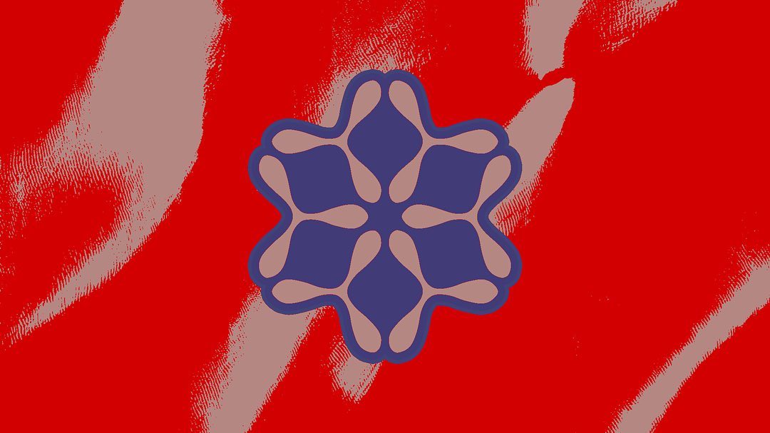
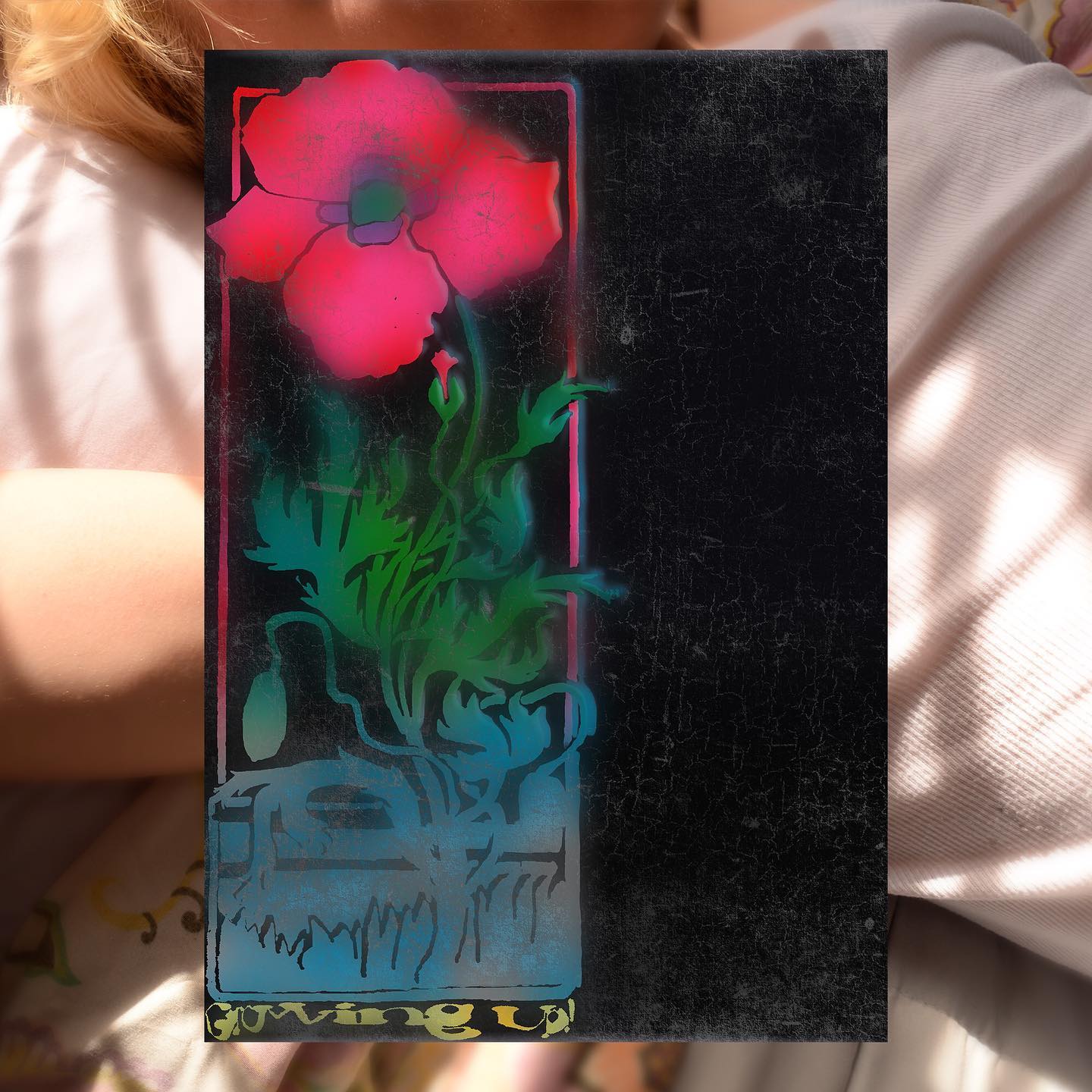
Selected Visual Works 85-92
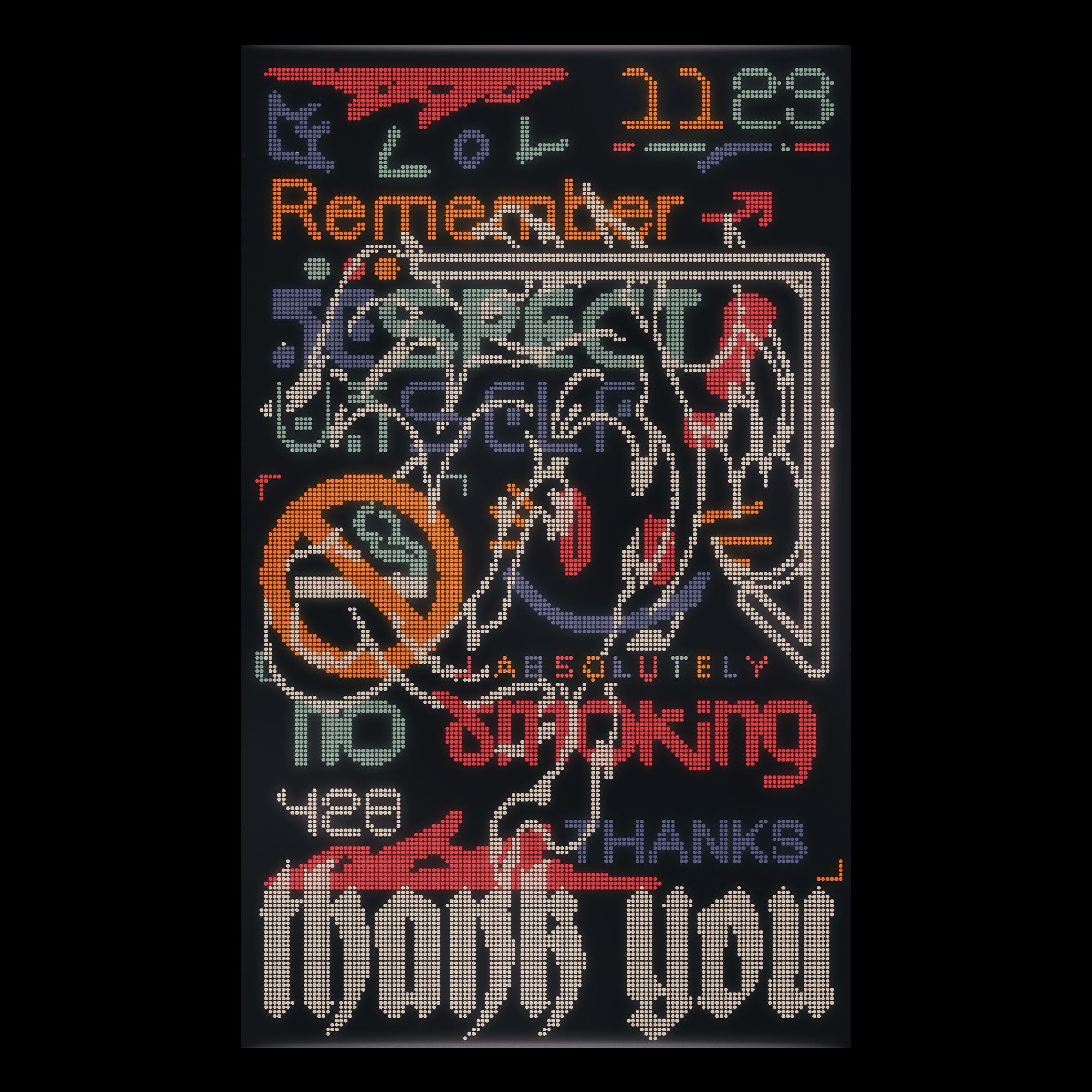
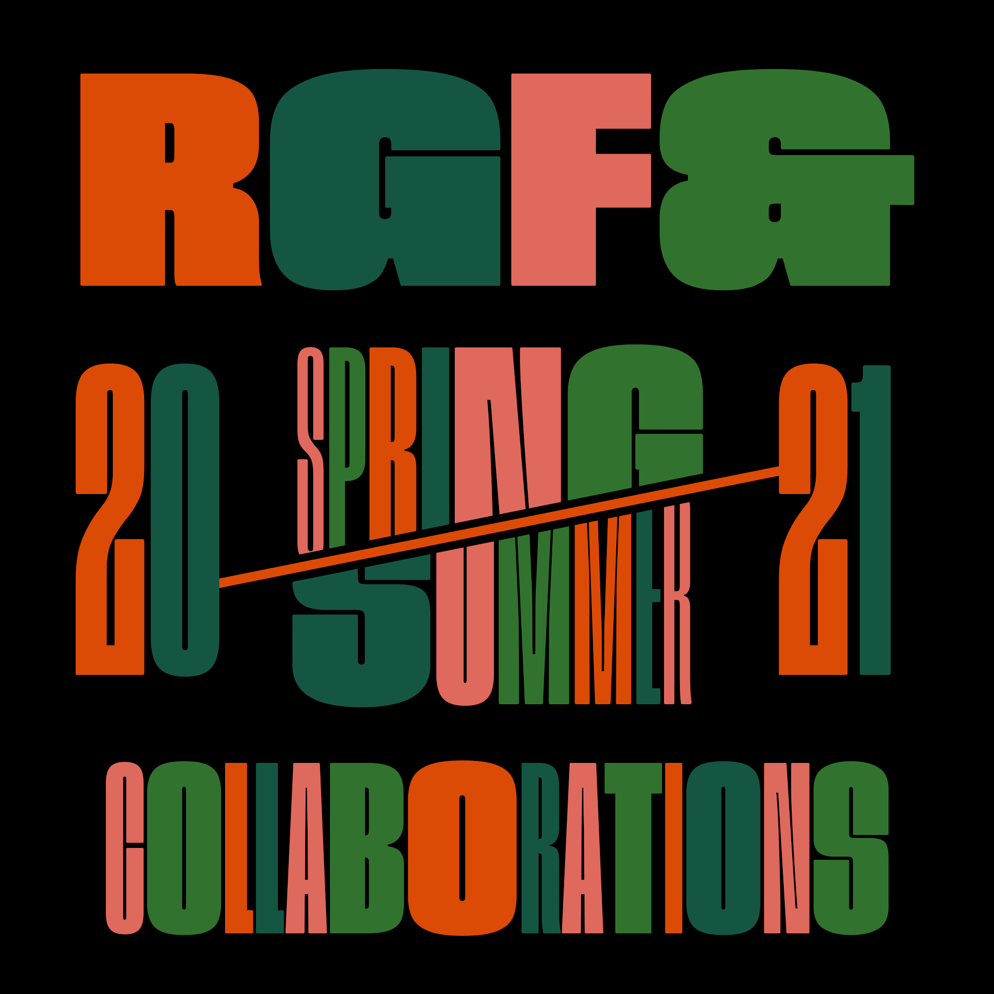
Below is an unsorted list of graphic work: logos, explorations, and digital artifacts.
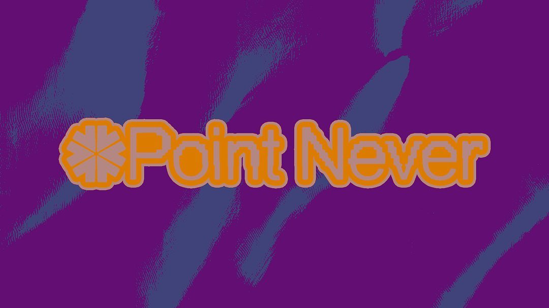
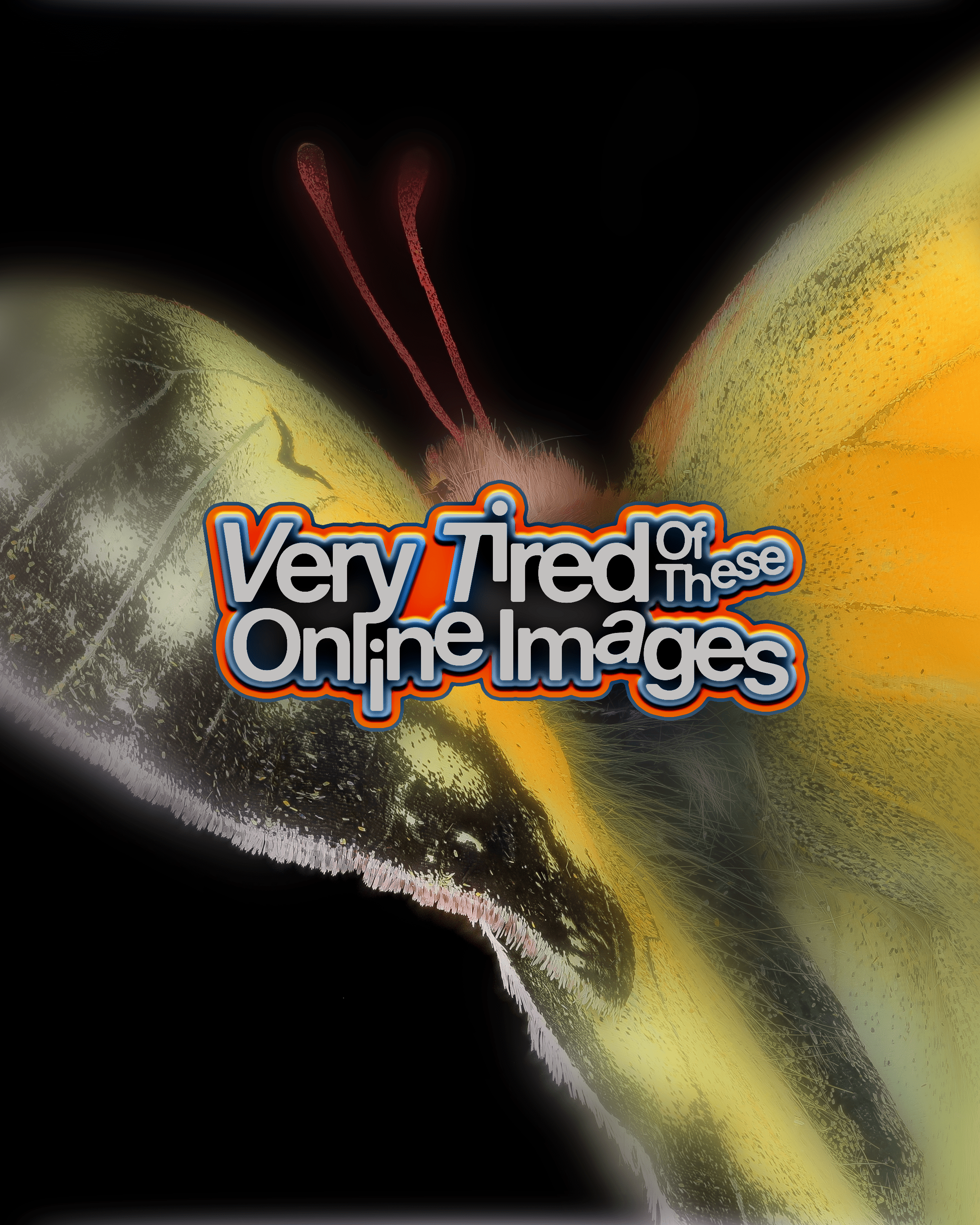
Visual Exploration
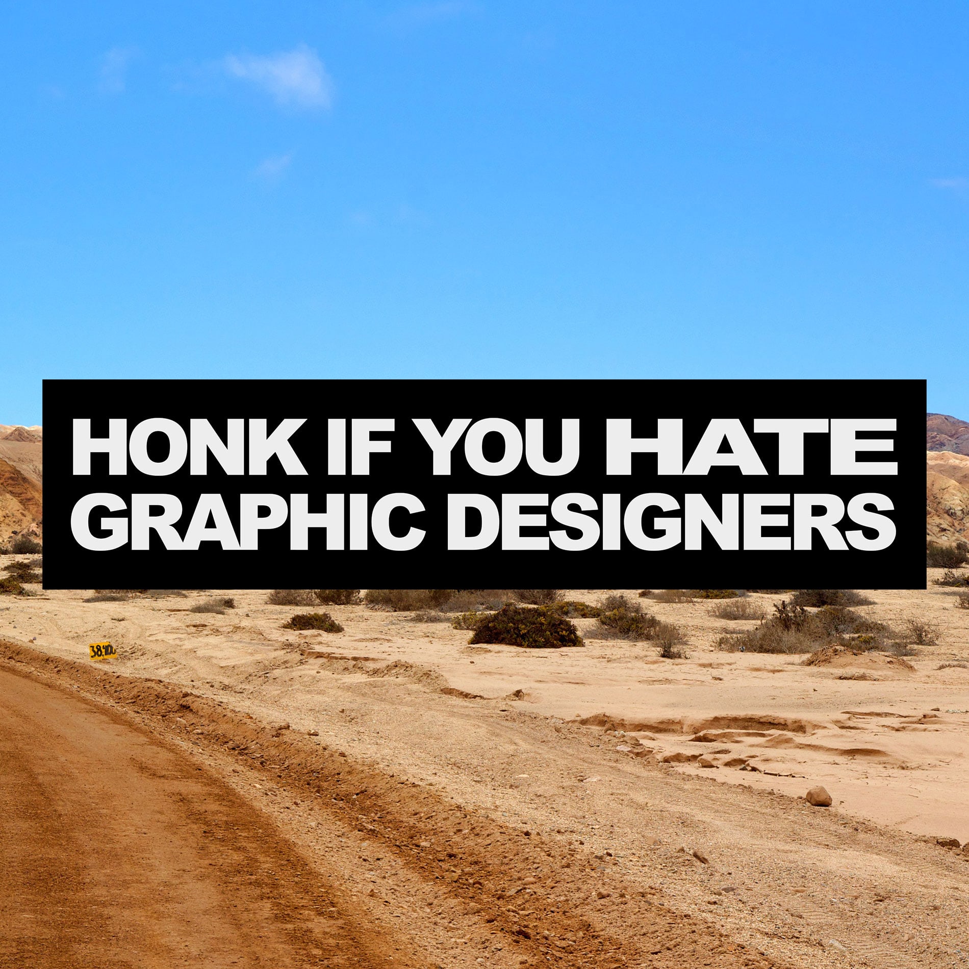
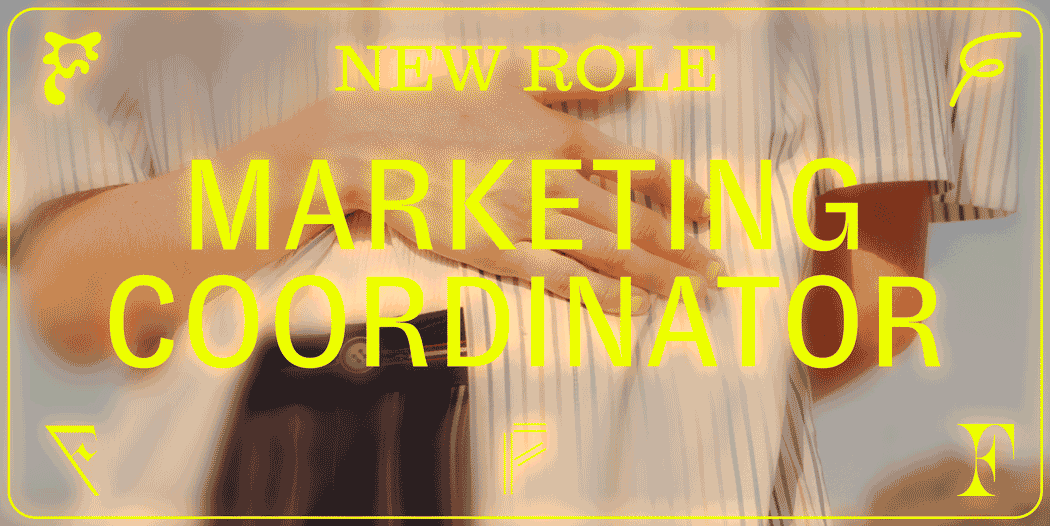
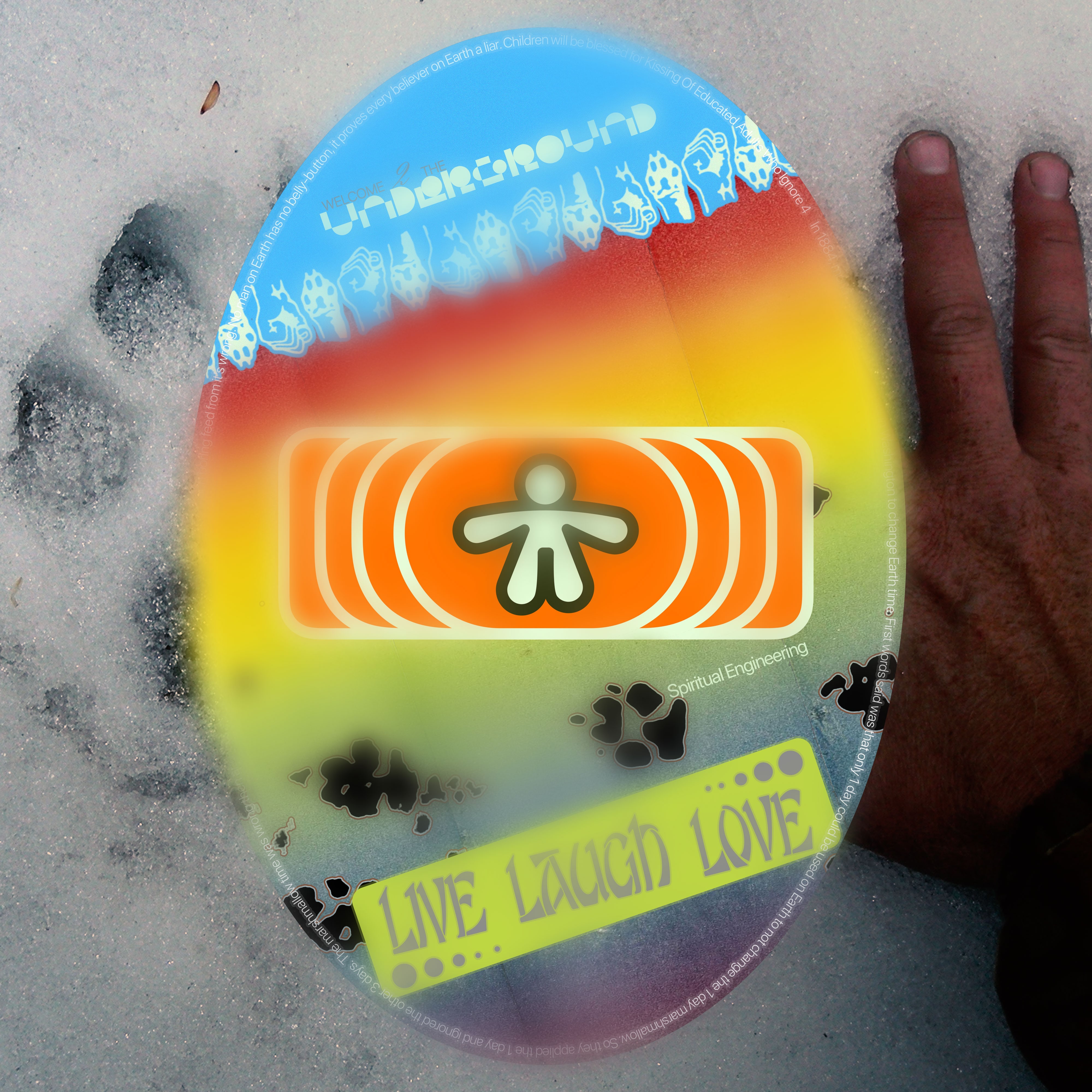
Bumper Sticker Concept
Logo for my awesome discord server
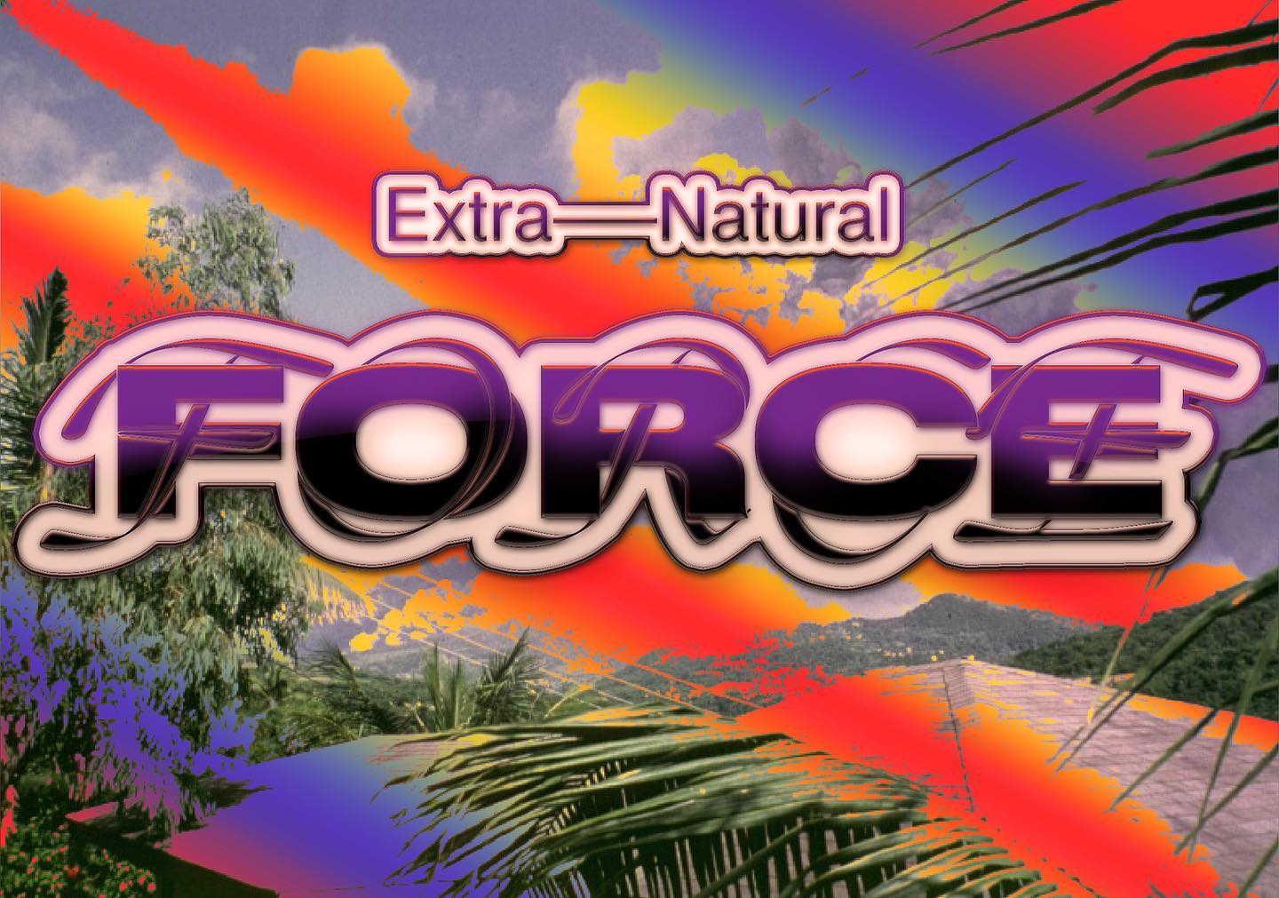
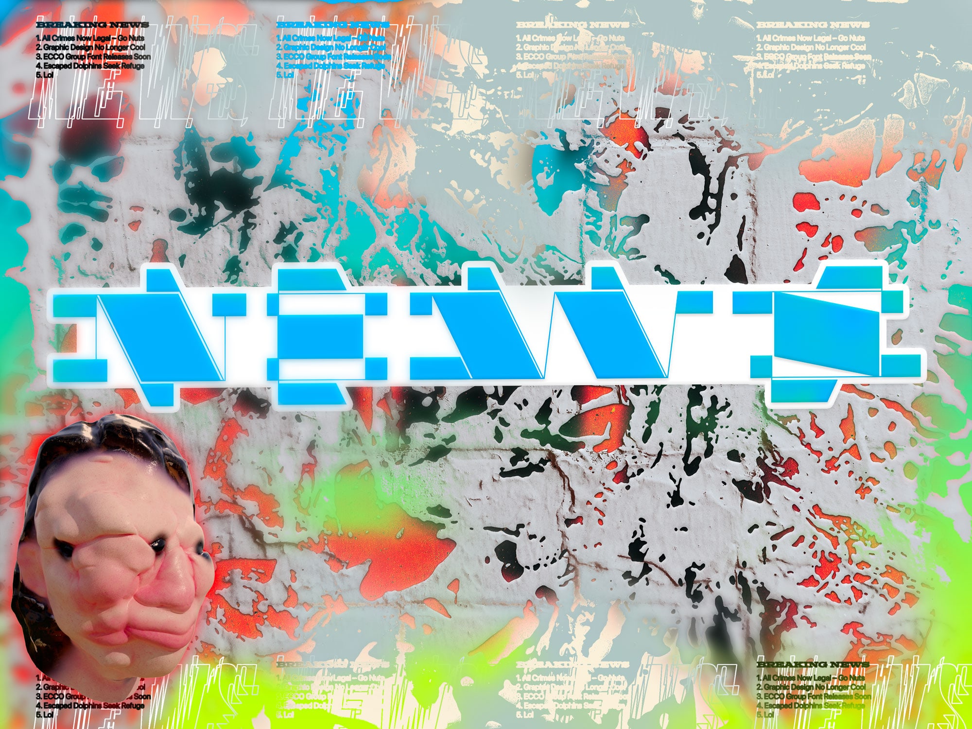
Digital Ad
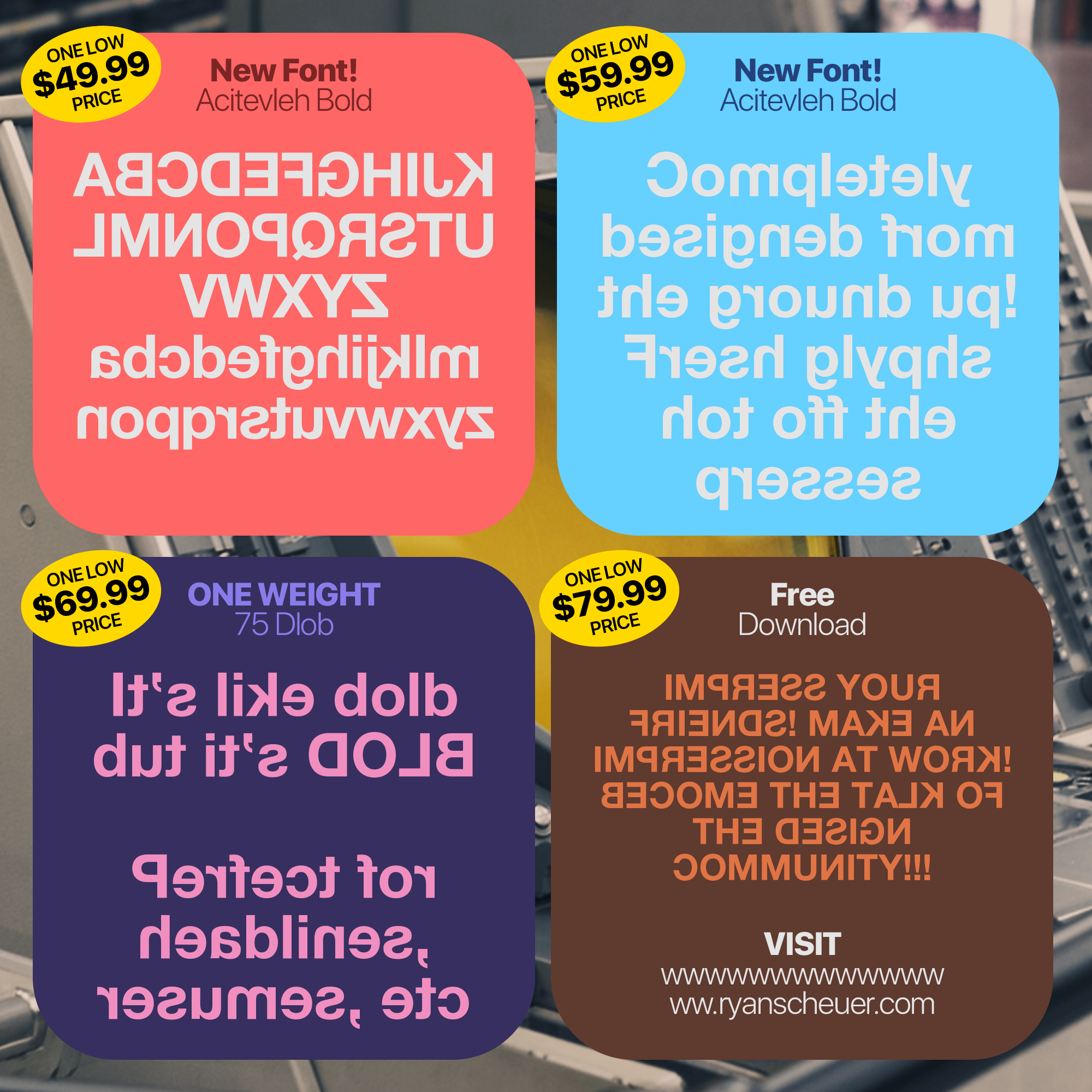
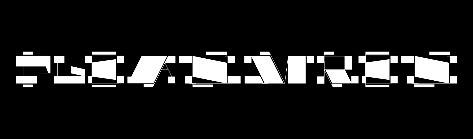
Horizontally flipped Monotype Helvetica for semilegal distribution
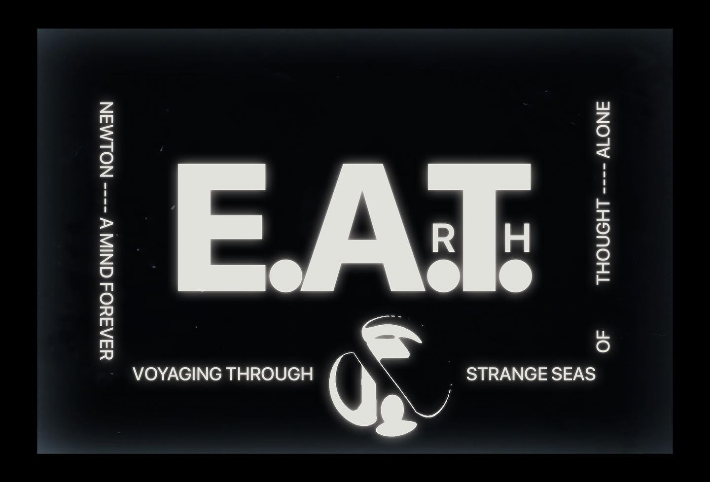
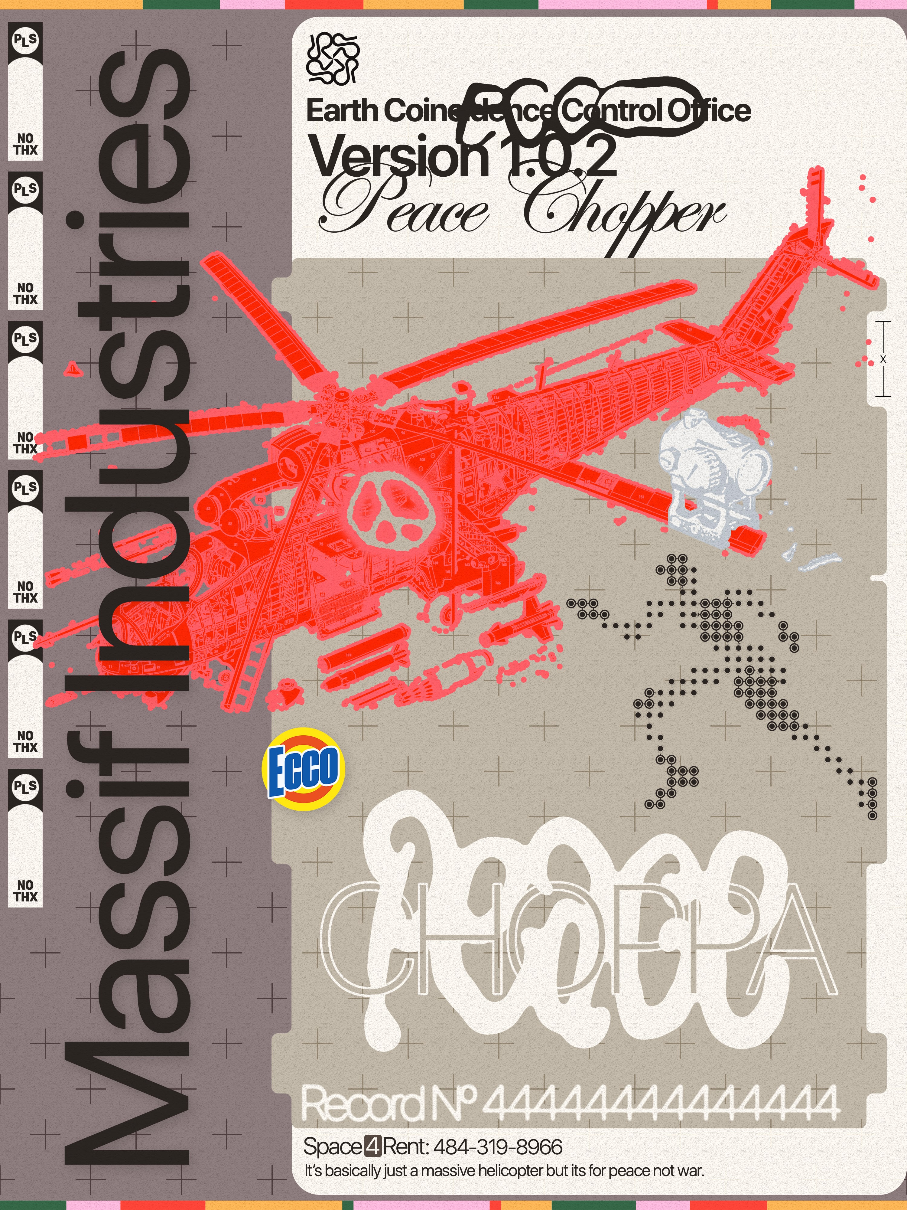
Logo for Irregular Labs' annual market report
More work for Irregular Labs
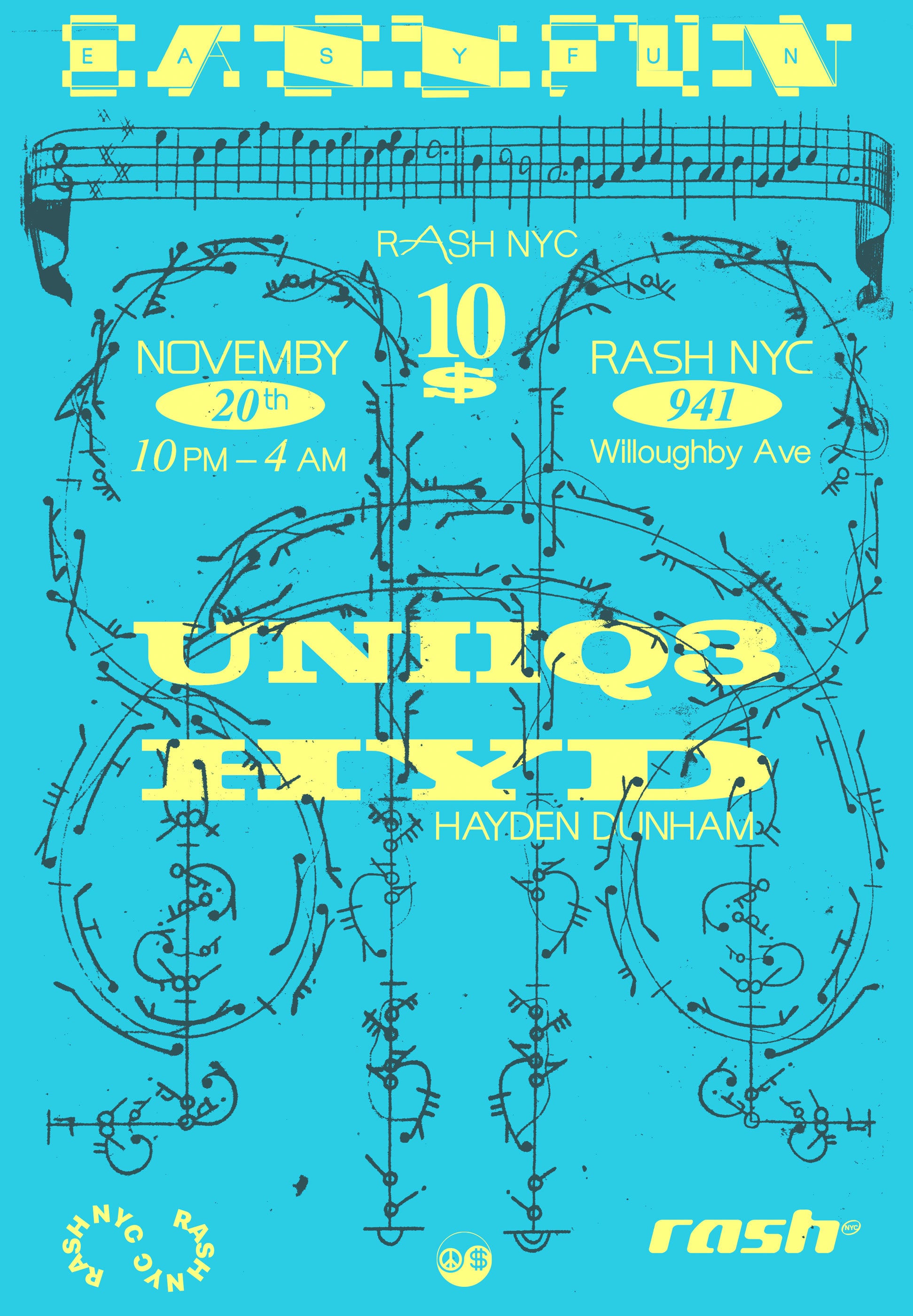
Poster for an insane PC Music show at Rash NYC
Logo & promotion for a typeface distribution platform
"I ain't got no type" -Rae Sremmurd
Selected Type Works Volume II
Below is a selection of "pure type" work. Most of these are demos of full hand-drawn typefaces.
Type exploration for a clothing brand

Type exploration for a men's grooming brand
Type design for a NY-based musician
It's got an elephant!!!
Clothing graphic for an eSports team

Custom type for NGHTMRE's U.S. tour
Type exploration for a record label
Typeface demo

NDA type work for a beloved fashion house
http:///////
Experience Design & Engineering
Collaborating with designers, project owners, and other stakeholders to design and develop interactive digital experiences. I build with modern tech stacks, primarily using Next.js and Sveltekit as UI frameworks and Node/Express for all other backend stuff.
Below is a list of recent interactive works on the WWW.
SIZED Studio
Headless storefront and editorial site for L.A. based gallery and studio. Custom search functionality cataloging over 300 products. Led design sprints and onboarding workshops.
Next.js, Sanity, Shopify API, Tailwind, Figma
2022
Faculty
Refactored, redesigned, and currently maintaining site for Faculty. (NDA: Developed internal APIs, dashboards, and accounting software for investor and internal stakeholders)
Shopify Liquid, CSS, Node.js
2021 - 2022
Reuben Selby
Redesigned & refactored a headless storefront experience for fashion designer Reuben Selby
Sanity, Shopify API, Styled Components
2021 - 2022
Painting a Website
Mini workshop with Index Space on web development basics and some bonus P5.js learning.
Workshop
2022
General Purpose
Collaborated with the wonderful designers at General Purpose to develop a bold web presence.
Kirby CMS, P5.js, CSS
2022
Mylo Stories
Design, compliance consulting & development for mushroom "un-leather" producer Mylo.
Wordpress, Javascript, CSS
2021
Regenerative Futures
Website design, world-building & development for Irregular Labs's annual Gen-Z report. The site is designed to be the community homepage of a fictional utopian settlement.
Kirby CMS, Three.js, CSS
2021
sorry if the image preview thing is buggy 🙃 it's a WIP